
Enter the text color and the solid background color as six-digit hexadecimal values, such as #333333 and #ffffff. The checker calculates their WCAG 2.x contrast ratio and compares it with the AA and AAA text thresholds. It does not inspect a page or certify that a website is accessible.
Use this tool for a known pair of opaque sRGB colors. If text sits on a photograph, gradient or translucent layer, identify the actual rendered color combination with an appropriate inspection tool. Entering the color of one layer alone can describe a different pair from the one the reader sees.
Understand the result
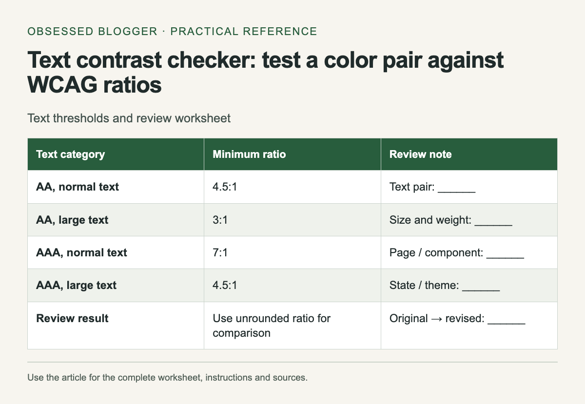
WCAG's minimum text-contrast criterion requires at least 4.5:1 for normal text and 3:1 for large text, subject to its stated exceptions. Large text means at least 18 pt regular or 14 pt bold. The enhanced criterion uses 7:1 for normal text and 4.5:1 for large text.
The result is rounded for display, but the pass comparison uses the full calculated value. A ratio just below 4.5 must not pass because a rounded label displays 4.50. If your design is near a threshold, choose a little more separation and recheck the actual implementation.
Start with a specific text role
Write down what you are checking: article body, helper text, button label, table heading or a caption. Record the page and state. “Gray on white” is too vague to find the same combination later, especially in a product with several gray tokens and more than one white surface.
Copy the actual implemented colors where possible. A design file can be useful for planning, but a browser stylesheet may use a different token or opacity. Compare the intended value with the rendered component before closing a review item.
Make a controlled adjustment
If the pair falls below the relevant threshold, change one color and calculate again. For dark text on a light background, try a darker text value or a lighter surface. Keep the semantic role in mind: a change to a shared text token can affect many screens.
Save the original pair and the revised pair with their ratios. That makes the decision reviewable and avoids a vague instruction to “increase contrast.” After applying the change, revisit the component in context to check that neighboring text and controls remain understandable.
Check the states people encounter
A button may have different colors before and after interaction. A navigation item may sit on a different surface in a mobile menu. Build a short list of the states relevant to your component and inspect each rather than assuming one color-pair result covers them all.
The worksheet below is intentionally small enough to copy into a review note. Add rows for themes or interaction states when necessary. Keep typography beside the colors so the person reviewing the result knows which threshold you used.
Know what the calculation covers
The checker follows the relative-luminance calculation in W3C technique G18. It converts the sRGB channels before calculating luminance and then divides the lighter luminance plus 0.05 by the darker luminance plus 0.05.
A passing pair still needs readable typography and an interface that works with keyboard and assistive technology. Treat the result as evidence about this color pair, then keep the rest of the accessibility review attached to the actual page. The static threshold table remains available if JavaScript is disabled.
| Text category | Minimum ratio | Review note |
|---|---|---|
| AA, normal text | 4.5:1 | Text pair: ______ |
| AA, large text | 3:1 | Size and weight: ______ |
| AAA, normal text | 7:1 | Page / component: ______ |
| AAA, large text | 4.5:1 | State / theme: ______ |
| Review result | Use unrounded ratio for comparison | Original → revised: ______ |
Check two opaque sRGB colors
Colors stay in this page. This checker does not evaluate transparency, gradients, images or an entire website.
0 comments:
Post a Comment